
Google Photos is finally rolling out a floating bottom bar redesign on Android that changes how users navigate the app. The update replaces the traditional docked bottom navigation with a floating pill that sits above the screen edge, creating a more modern, less obtrusive interface and allowing more content to be visible beneath and beside the navigation element.
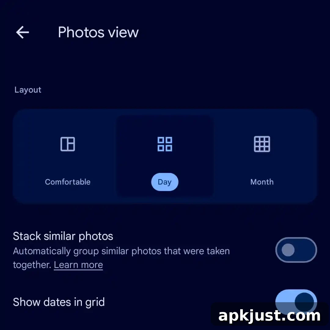
Update 7/17: This floating bottom bar has now been widely rolled out via a server-side update. If you are using Google Photos 7.83 and don’t see the new bar yet, try force stopping the app from App info to trigger the change. After the update, you may also notice adjustments to the main Photos grid. To make dates always appear, scroll down slightly until the three-dot overflow menu appears in the top-right corner of the grid, then enable “Show dates in grid” to restore the persistent date indicator.
Original 7/8: The most visible change is the bottom navigation itself. Instead of a bar fixed to the bottom edge of the screen, the design uses a floating pill containing three primary tabs: Photos, Collections, and Create. A small icon on the left of the pill highlights the active feed, and a circular button on the right gives quick access to search and the Gemini-powered Ask Photos feature, streamlining discovery and AI-assisted queries.
Alongside the floating bottom bar, Google Photos has moved the day indicator into a secondary floating pill that appears at the top of the screen when you scroll and then fades out after a short delay. This transient date indicator keeps the grid cleaner while still providing contextual time information when you need it.
If you prefer the previous, more static experience, the app still offers the older layout behavior. Tap the three-dot overflow menu under “Photos view” in the top-right corner and enable “Show dates in grid.” This setting centers labels like Today and Yesterday within the grid and restores a persistent date display rather than the new transient top pill.
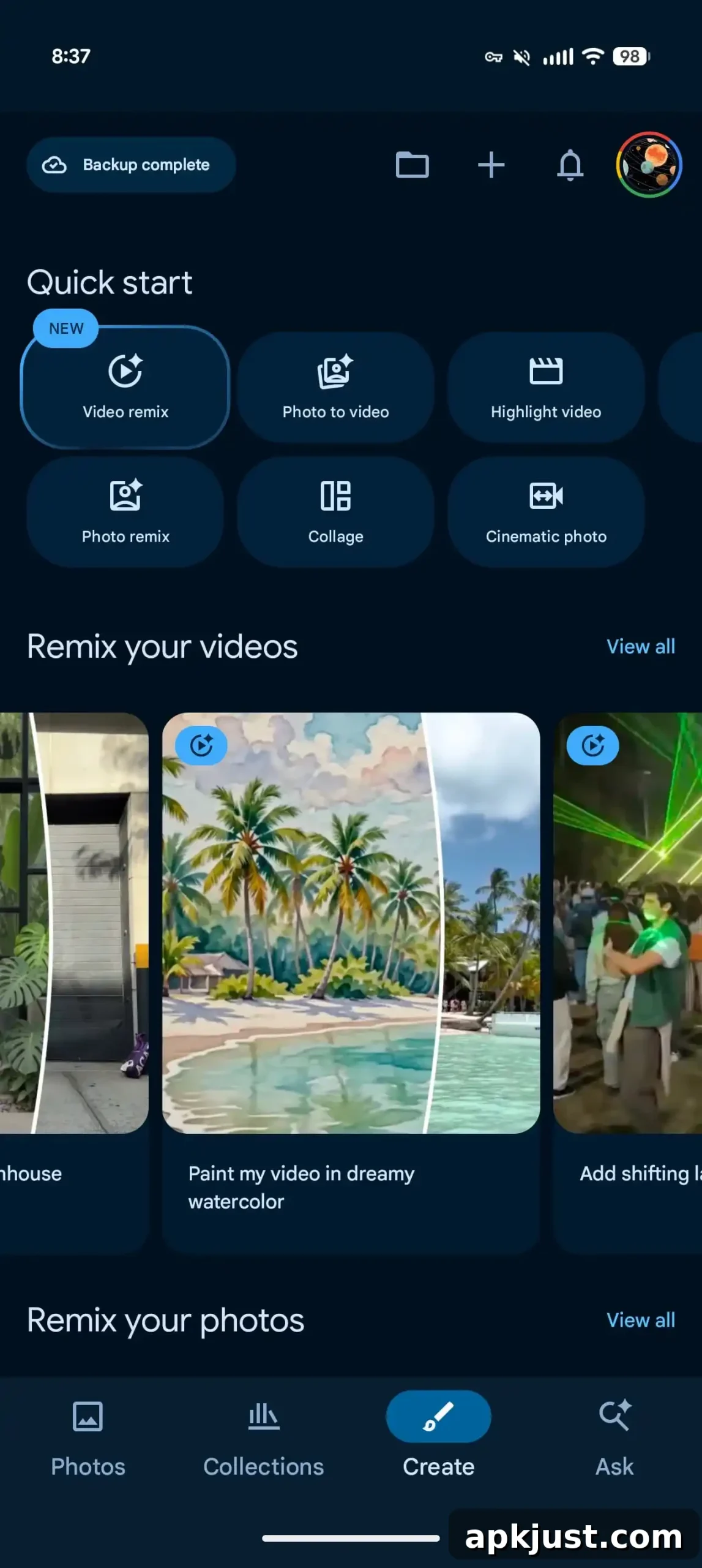
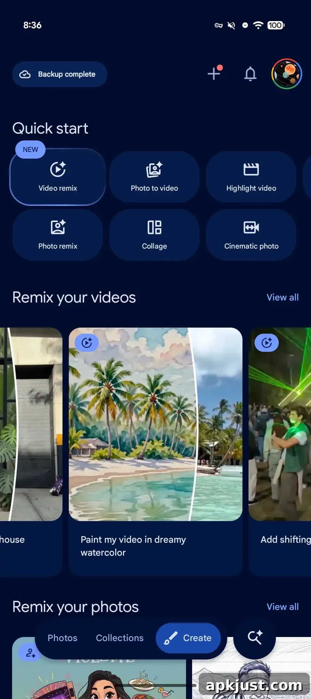
This floating bottom bar aligns Google Photos with other recent Google apps that have adopted similar floating navigation elements, such as Google Chat and Finance. While Material You (Material 3) includes a floating toolbar component, that component is not officially defined as a primary navigation bottom bar. Google Photos’ new layout repurposes the floating approach to serve as the app’s main navigation, blending expressive Material 3 visuals with functional, thumb-friendly controls.
The rollout has expanded through a server-side update to version 7.82 and later, though availability was previously limited to small test groups. The design has been present on iOS since earlier in the year, and Android users are now seeing the same navigation approach more broadly. If the new floating pill does not appear immediately after updating, force stopping the app from the system App info page can often prompt the server-side change to take effect.
If you want to fine-tune the interface after the update, remember the key settings location: open the Photos view, tap the three-dot menu in the top-right corner, and choose “Show dates in grid” to return to the persistent date indicator. This small toggle gives users control over whether dates remain visible at all times or only appear transiently while scrolling.
Overall, the floating bottom bar simplifies navigation while maximizing visible content in the Photos grid. It’s a subtle but meaningful redesign for users who spend a lot of time browsing image libraries, and it reflects Google’s broader shift toward floating, expressive UI components across its Android app ecosystem.