
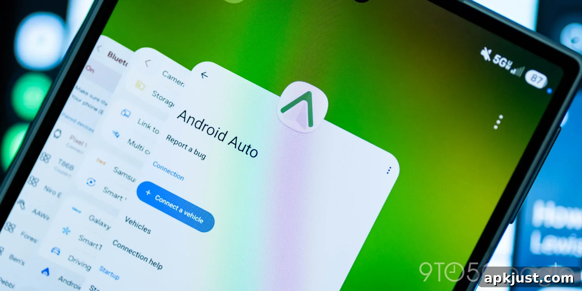
Google has started rolling out a subtle visual update to Android Auto in the 17.6 release, most notably changing the app icon and introducing a small tweak to the app’s wordmark and accent color. The update is minor but visible in a few places across Android for users who encounter the refreshed assets.
- Related: Android Auto tests Quick Settings and hilarious ‘Jimothy’ weather Easter egg [Gallery]
Over the past few weeks, some devices began intermittently showing a green Android Auto icon. With the Android Auto 17.6 update, that new green icon appears more broadly. The redesign is small — a color shift and a slightly refined mark — but it signals a move away from the long-standing blue icon many users have seen until now.


Artem Russakovskii of APKMirror first called attention to the change, and the APK archive shows this is the first Android Auto release that fully adopts the new green variant. Prior versions generally used the conventional blue icon, so this marks a visible branding update for the app.
Google has also updated the official Android Auto website to reflect the new design. The refreshed look appears in promotional material and thumbnails that reference recent feature additions, such as Gemini integration. In addition to the icon color change, the Android Auto wordmark has been subtly adjusted — small refinements to letter spacing and weight that keep the mark familiar while modernizing its appearance.
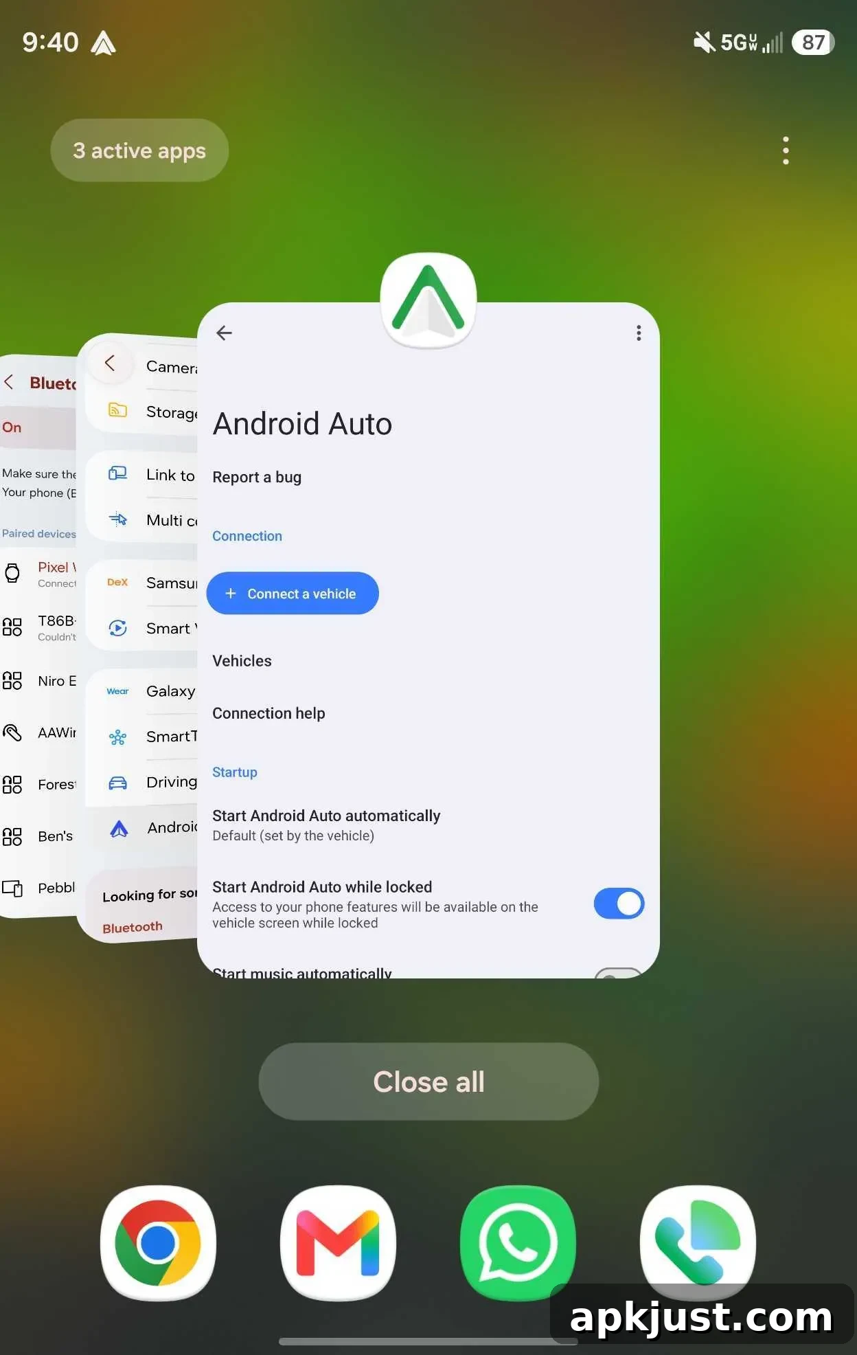
For most users, the updated icon will not yet be visible in every context. We’ve observed the green icon in some notifications, but many notifications still show the older blue version. On Android devices, the most consistent place to spot the new green icon is in the app switcher when accessing Android Auto settings. In other words, the rollout is gradual and currently limited to specific UI surfaces.
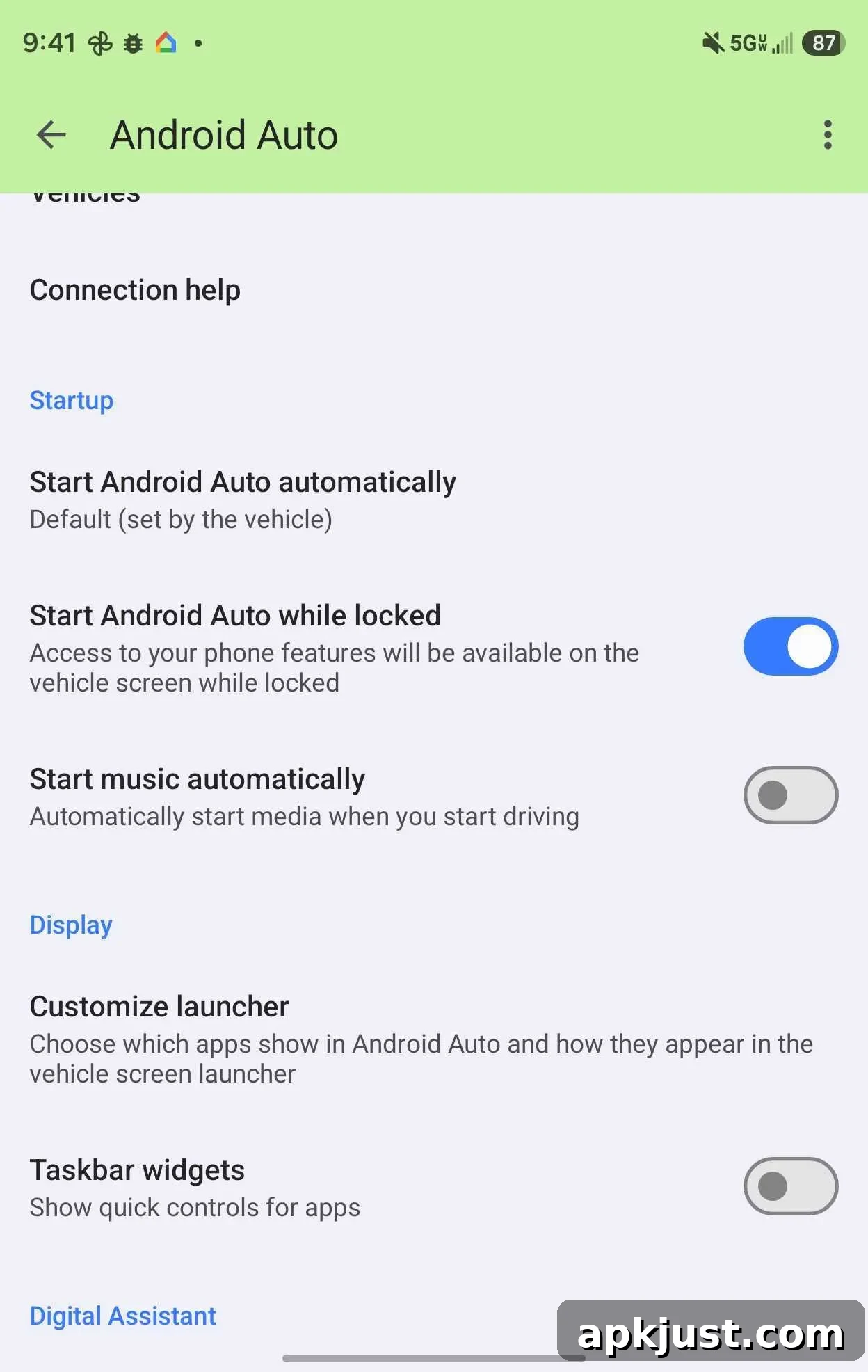
Beyond the icon itself, Android Auto’s settings menu now shows a green accent color that aligns with the new icon. This small visual change helps create a more cohesive brand experience when you open Android Auto settings and menus, matching the refreshed icon’s palette. The green accent is a subtle but deliberate choice to bring consistency to the app’s look and feel.
More on Android Auto:
- Google Maps bug won’t show traffic data on Android Auto and more
- Android Auto is still the best in-car entertainment experience despite its foibles
- Google Maps rolling out Immersive Navigation, speedometer in Android Auto to more users
This 17.6 update does not bring sweeping functional changes, but brand and interface touches like the icon color, the refined wordmark and the matching green accents make the experience feel a little fresher. These kinds of small visual updates often precede broader design work, and they help keep the app’s identity aligned with broader Google design language across Android and web surfaces.
Follow Ben: Twitter/X, Threads, Bluesky, and Instagram