
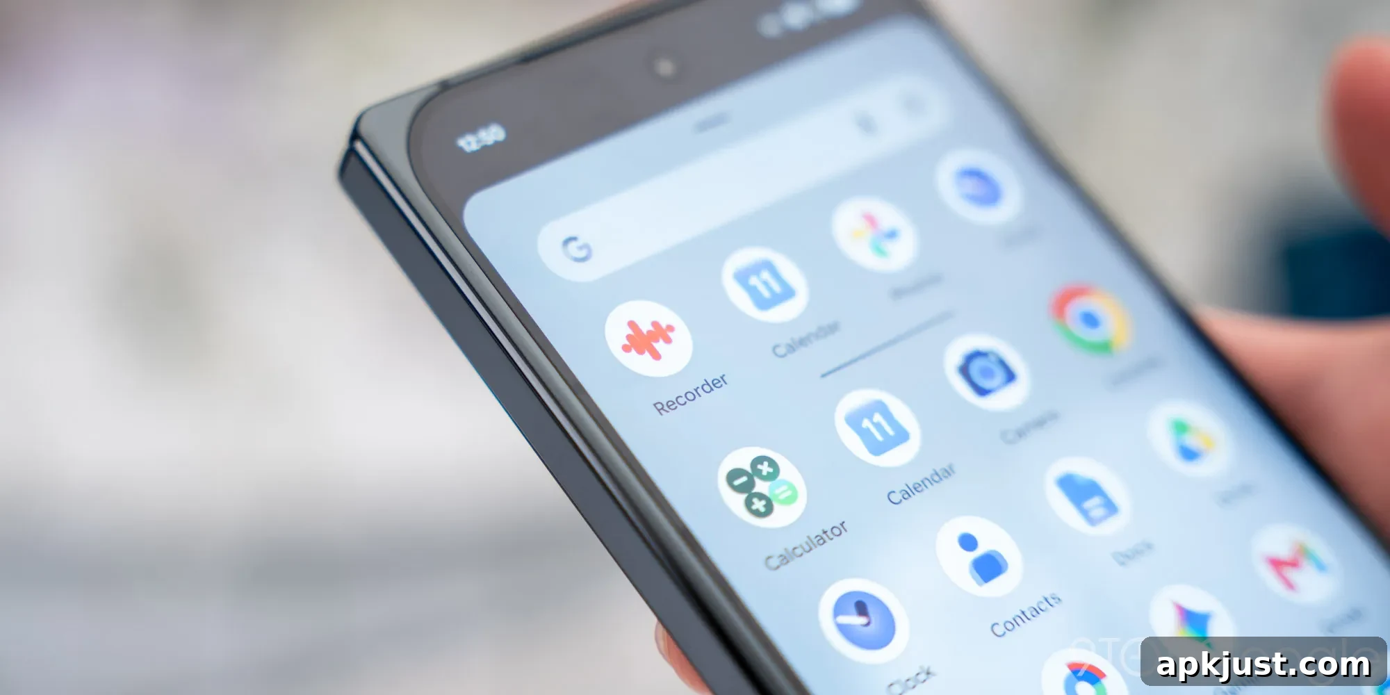
Google Clock, available on all Android devices, received a refreshed icon as part of updates rolling out around the Pixel 11 launch. At the same time, Pixel Magnifier picked up a redesigned icon. These visual changes follow Google’s ongoing effort to unify its first-party app icons and give them a consistent, modern look.
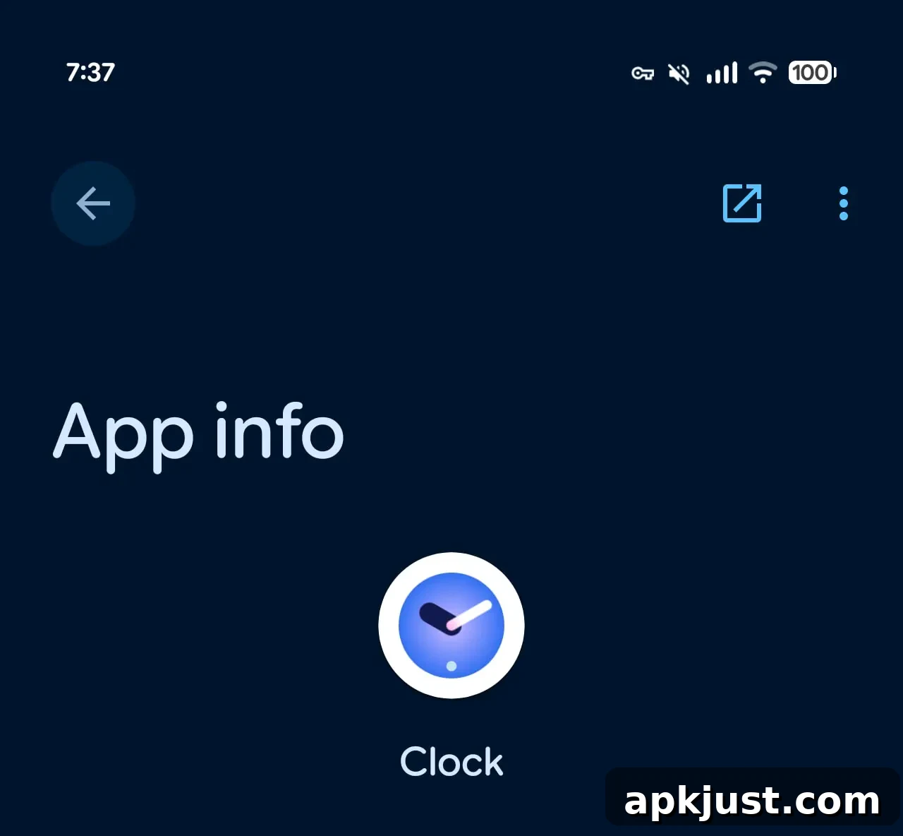
The updated Google Clock icon echoes the styling seen on Pixel Watch faces: the hour and minute hands are represented by thick, rounded pills. The clock face is blue with a subtle gradient, but it no longer extends to the edges of the icon. Instead, the clock graphic sits on a white rounded square background, matching the current aesthetic used across many Google apps. This places the Clock app squarely within the broader icon design language Google has been applying to its suite of apps.
Chrome remains one of the larger exceptions to this trend, retaining its own distinctive circular browser emblem. Chrome’s icon is a more complex, multi-color design and in some environments — notably macOS — it is already presented within a rounded square shape, which narrows the visual difference compared to newer Google icon treatments.
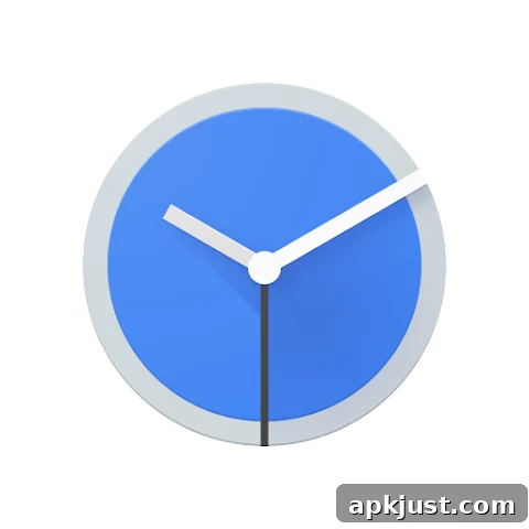
Old vs. new
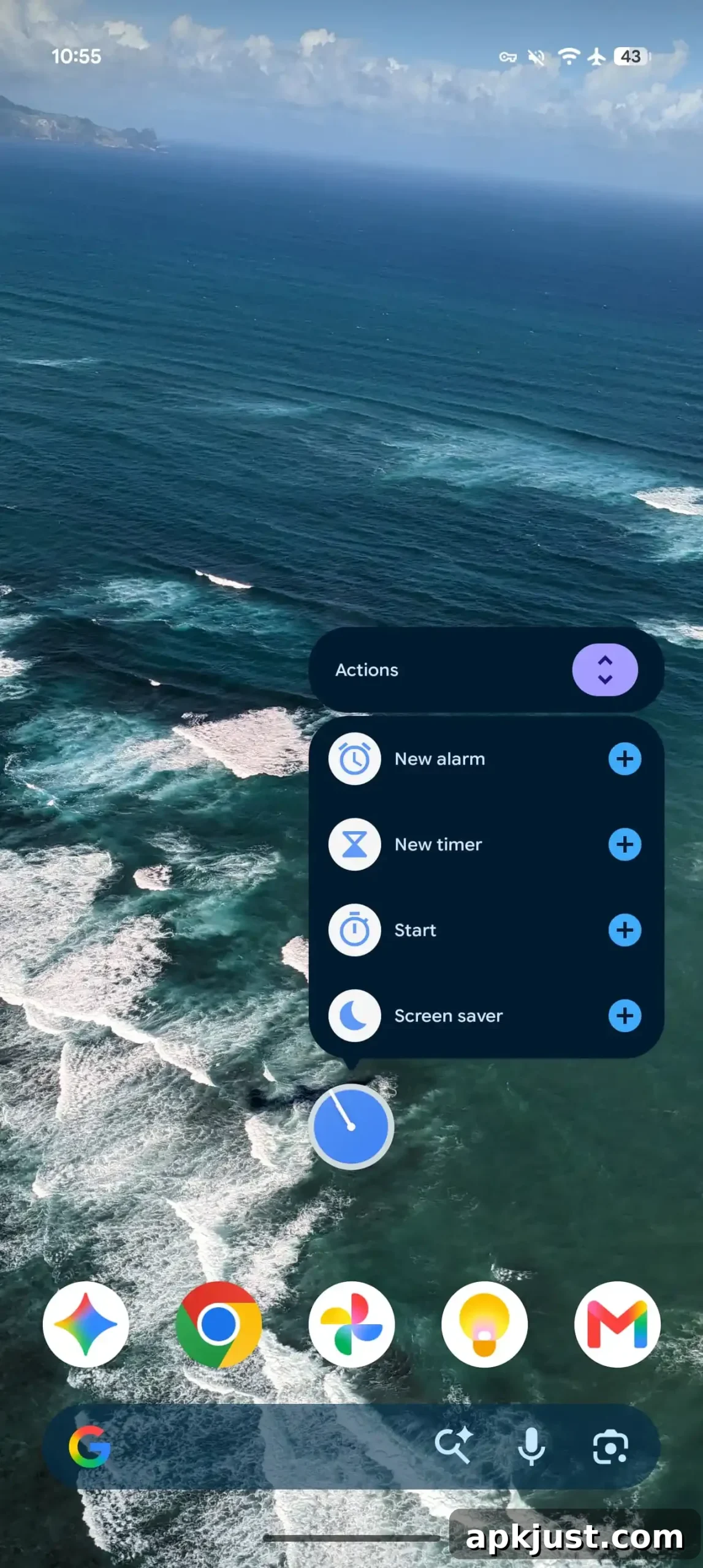
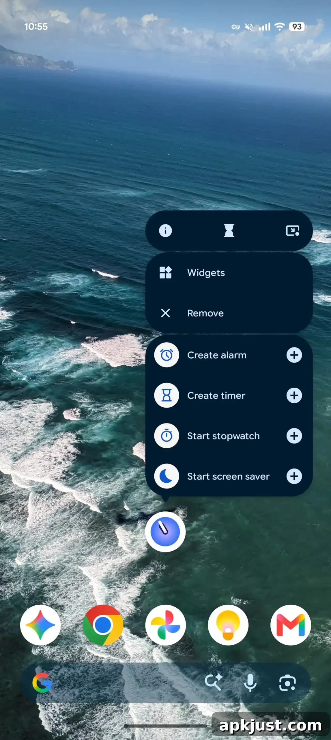
In the non-live version of the new icon, the clock hands are positioned at roughly 9:10, with a small dot marking the 30-minute position. App shortcuts have also received small refinements: the quick actions now read “Create alarm/timer” instead of the previous “New alarm/timer.” Aside from these visual and label updates, there do not appear to be functional changes inside the app itself.
Version 9.1 of Google Clock is now widely available through the Google Play Store. The update mainly focuses on iconography and shortcut wording, rather than adding or changing core features such as alarms, timers, or world clock behavior. Users who prefer visual consistency across their device’s home screen will likely appreciate the new appearance, while those focused on functionality will find the app unchanged in operation.
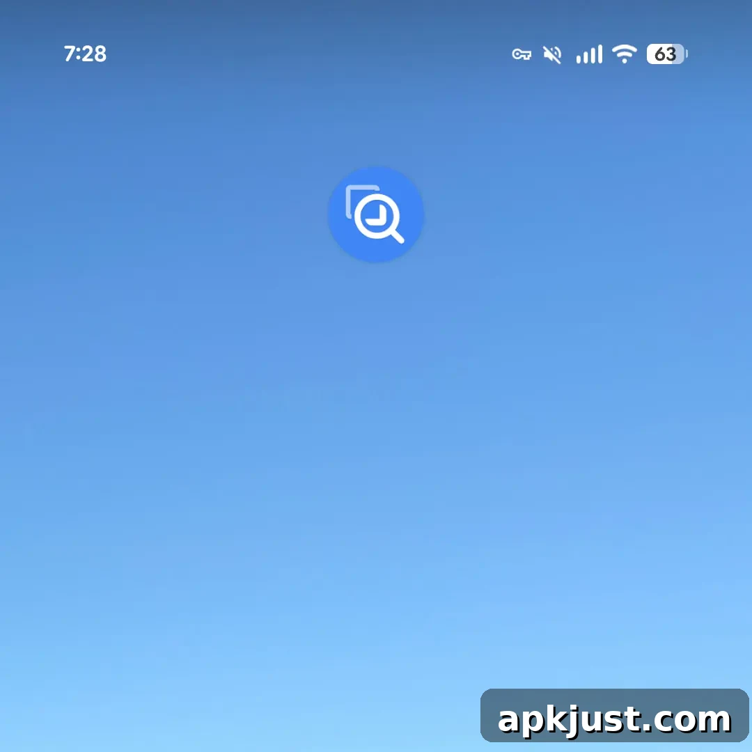
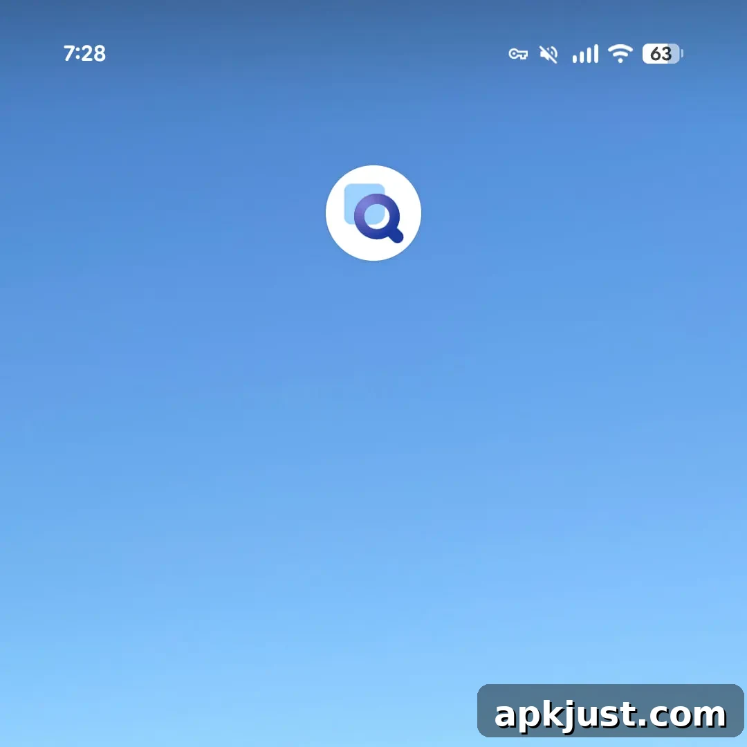
In a separate update, Google released a new version of Pixel Magnifier that similarly adopts the refreshed icon style. The Pixel Magnifier update replaced the solid blue background with a lighter, filled square and a thicker magnifying-glass graphic that uses a subtle gradient. This mirrors recent icon changes for other Pixel utilities, such as the Thermometer app, and brings the Magnifier icon in line with the overall simplified visual language Google is applying to system and accessibility tools.
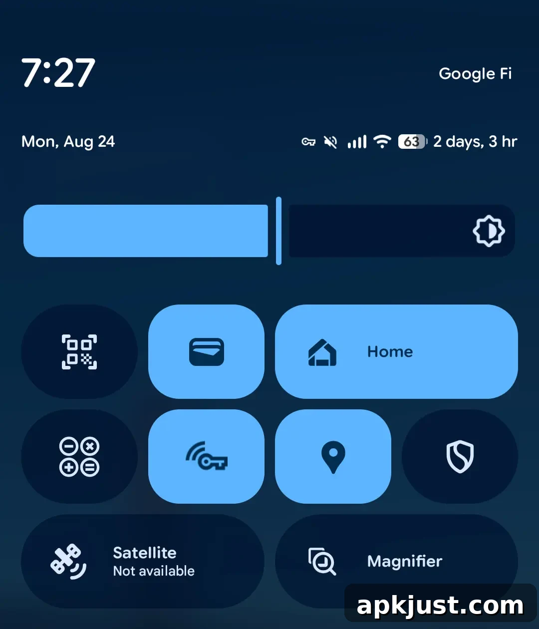
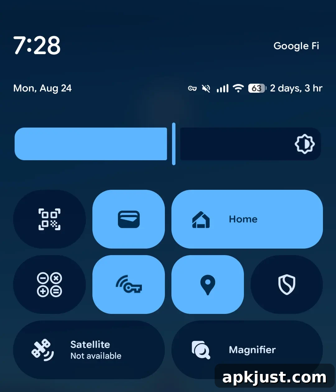
The Quick Settings tile for Pixel Magnifier was also updated so the tile graphics align with the new app icon. Functionally, the app remains the same—there are no reported changes to the user interface or the magnification features. The update is largely cosmetic, intended to bring consistent visual treatment across Pixel apps and system components.
Overall, these updates are part of a broader visual refresh across Google’s app lineup. They prioritize a cohesive, simplified icon style that improves visual harmony on Android home screens and quick settings. While the changes are primarily aesthetic, they reflect Google’s continued attention to detail in the platform’s design language and help keep the look and feel of Pixel and Android apps current.