
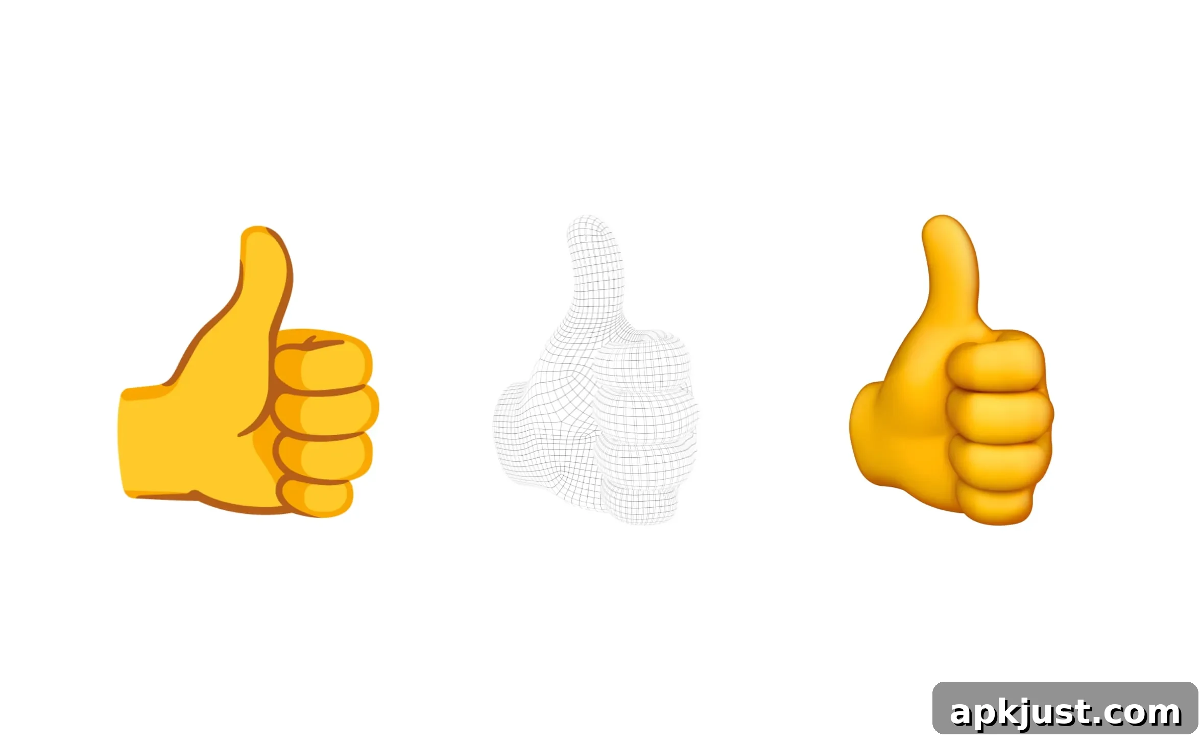
To mark World Emoji Day, Google has shared details about the redesign of its emoji system, introducing a new 3D style for its entire emoji library. Announced earlier this year and previewed during The Android Show, the update transforms all 3,977 emoji into three-dimensional designs intended to feel more expressive and relatable while avoiding photorealism.
Historically, Google’s emoji approach prioritized clear expression over exact realism. Moving to 3D allowed designers to add depth and personality without attempting anatomical or photographic accuracy. The team emphasized that the goal was to preserve playfulness and emotional clarity — giving characters a sense of presence rather than creating cold, overly literal recreations of real-world objects and animals.
They need a pulse and a soul — not the cold precision of industrial CAD models. Have you looked closely at a real kangaroo? They’re terrifying. We don’t need anatomical perfection. With the power of illustration, we can capture the true, playful vibe of a kangaroo.
Designing and testing a complete emoji redesign is a complex process that involved extensive user research. Google conducted large-scale studies to measure how changes to form, posture, and detail might affect how people interpret and connect with emoji. From those studies the team identified several consistent findings important to effective emoji design:
- Users strongly prefer full-body animal illustrations rather than isolated floating heads, as full-body forms communicate intent and emotion more clearly.
- Adding extra props or accessories can reduce clarity and hurt immediate comprehension, so designers aim to keep visual noise to a minimum.
- Small adjustments — such as the direction of a wink or the tilt of a mouth — can dramatically change how an emoji is perceived, sometimes turning playful intent into unintended offense, so every tweak is tested carefully.
The shift from flat drawings to fully modeled 3D characters required the team to resolve a series of architectural questions that don’t exist in 2D art. For example: what should the unseen back of a smiley face look like? Should it behave like a soft, bouncy sphere, a thin flat surface, or a slightly concave mask? Decisions like these affect how emoji read from every angle and how coherent they feel across different contexts and animations.
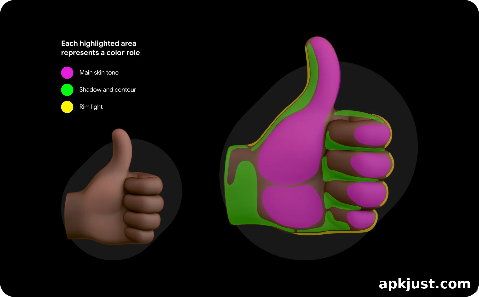
Accessibility and visibility were key considerations during the redesign. Google called out the challenge that emoji with darker skin tones can be hard to distinguish in dark mode interfaces. To address that, the design team created tools and workflows to ensure good contrast across backgrounds. These processes help detect when contrast is too low and suggest higher-contrast variations that designers can apply, improving readability and consistent recognition for all users.
That’s why we built an AI-powered contrast tool that analyzes each emoji at the pixel level, flags when the contrast ratio is too low and suggests high-contrast solutions that are implemented by designers.
The new Noto Emoji 3D set will first arrive on Pixel phones later this year, with a broader rollout to other Google products to follow. In keeping with Google’s commitment to open design, all characters will be available as open-source 3D models in standard formats (.OBJ files), enabling developers, designers, and creators to access and integrate the assets in their own projects.
By reimagining emoji in three dimensions while prioritizing clarity, accessibility, and emotional intent, Google aims to make emoji feel more alive and communicative. The redesign retains the familiar visual language users expect while refining shapes, gestures, and color relationships so that emoji perform consistently across devices, modes, and cultural contexts. As these 3D characters roll out across platforms, users can expect a more tactile, expressive, and legible set of emoji that better supports the subtle nuances of everyday digital conversation.