
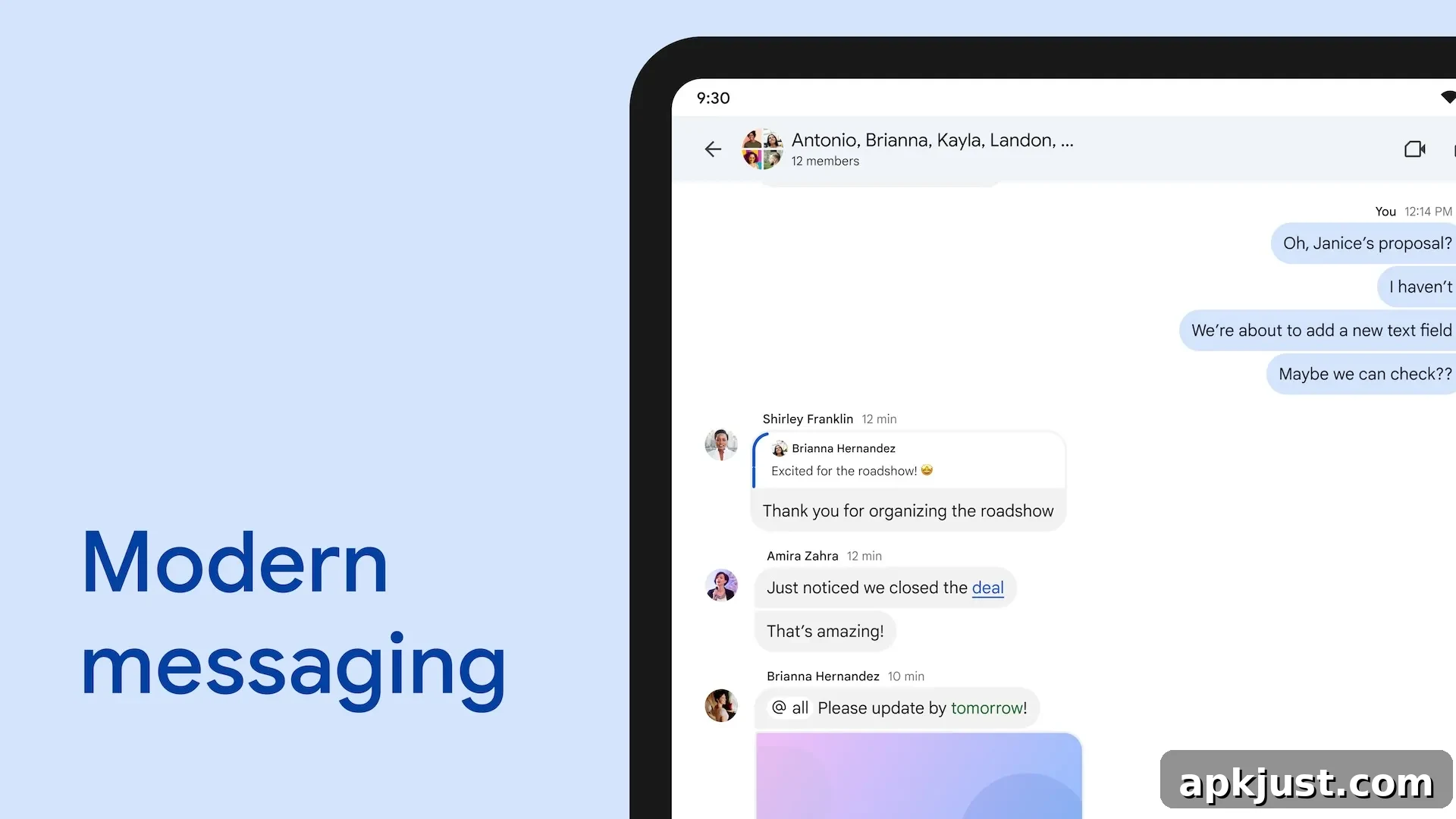
With the new Workspace icons fully rolled out, Google has adjusted how the Chat icon appears in the Android status bar to prevent confusion with Messages. The homescreen icons are already visually distinct by color, but at small sizes—like the status bar—the two looked very similar. This change aims to make it easier to distinguish personal messages from work chat notifications at a glance.
On the home screen, Google Chat and Messages remain differentiated by their color schemes: Chat traditionally uses green shades while Messages uses blue. Despite this, both icons share a two-bubble chat motif with tails positioned toward the left side, albeit facing opposite directions. At reduced scale, the subtle differences in shape and a tiny smile used previously for Chat were not always enough to avoid misidentification.
Old
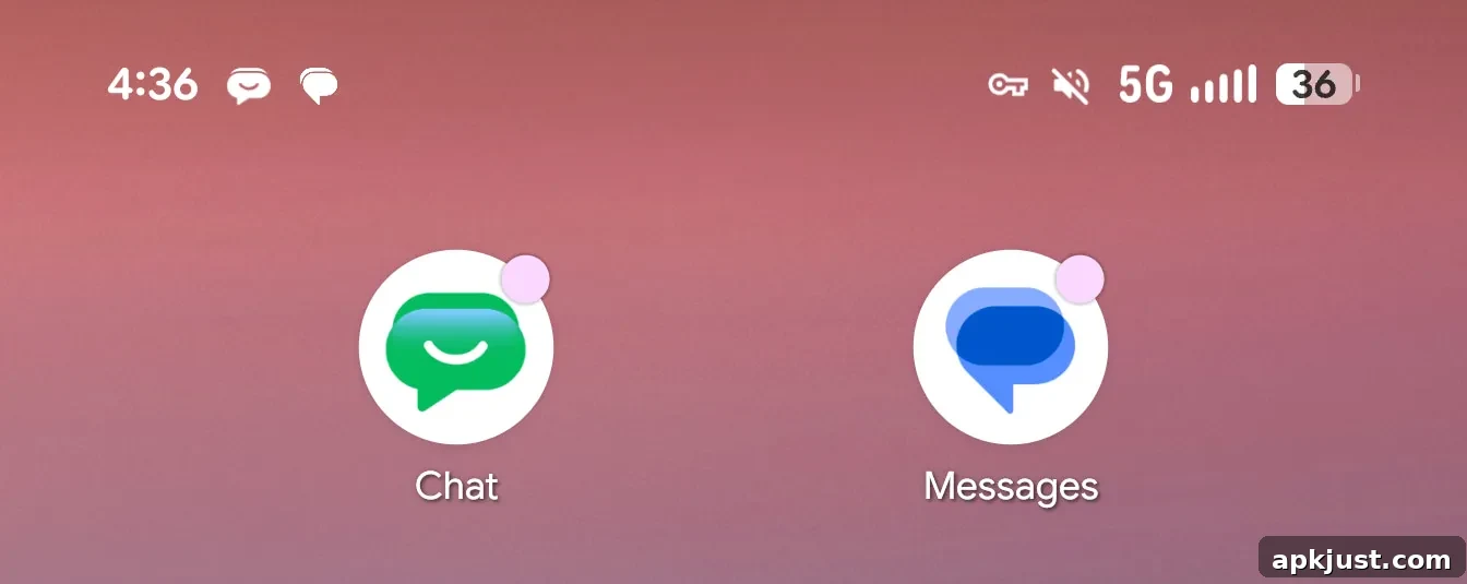
The previous status bar icon for Google Chat was basically a scaled-down, filled white version of the app’s home screen mark. It relied on a small smile detail to separate it from Messages. At notification size, however, the filled silhouette and similar bubble arrangement made it easy to mistake one for the other—especially when both apps might generate frequent alerts.
This resemblance could be particularly problematic for organizations that use Google Chat as their primary communication tool. When work and personal notifications appear visually similar in the status bar, it can lead to missed personal messages or accidental attention to work alerts during off-hours. For users who need a quick visual cue to distinguish contexts, a clearer status icon is important.
Google has now shifted the Chat status icon to an outline-style design. The new icon preserves the two-bubble composition but renders it as a hollow or stroked shape rather than a filled mark. That outlined treatment increases contrast against the status bar background and emphasizes the structure of the icon, making it easier to tell apart from the filled Messages icon at small sizes.
New
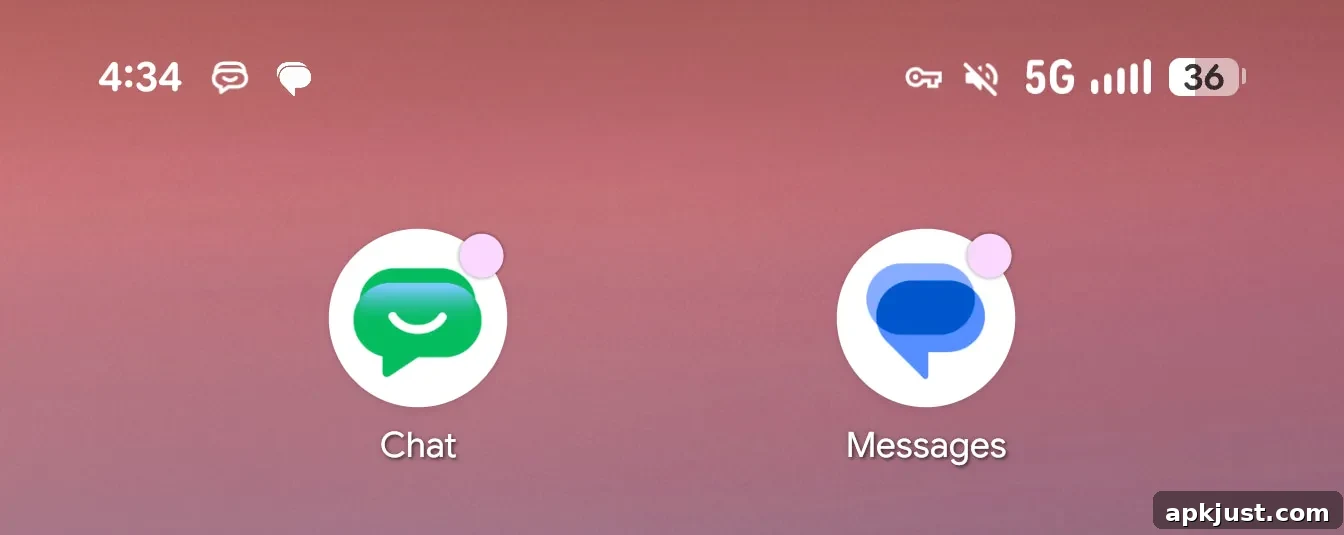
The outlined appearance reduces visual weight and improves legibility at the tiny sizes used in Android’s status area. The hollow interior makes the bubble shapes more identifiable and helps the icon read as distinct from Messages even without relying on color. In practice, the adjustment should reduce the number of times users confuse the two apps when checking their notification bar.
This update is included in the 2026.06.01.x release of Google Chat for Android, which began rolling out widely recently. The broader Workspace icon redesign—featuring gradient versions for core apps—also completed its roll out last week, with one notable exception being Gmail for Android, which has been updated on a slightly different schedule.
Overall, the change reflects a small but useful refinement in visual design that prioritizes clarity. By moving from a filled to an outlined status icon, Google has made it easier for users to distinguish between work and personal messaging at a glance, improving usability for anyone who relies on multiple messaging apps throughout the day.