
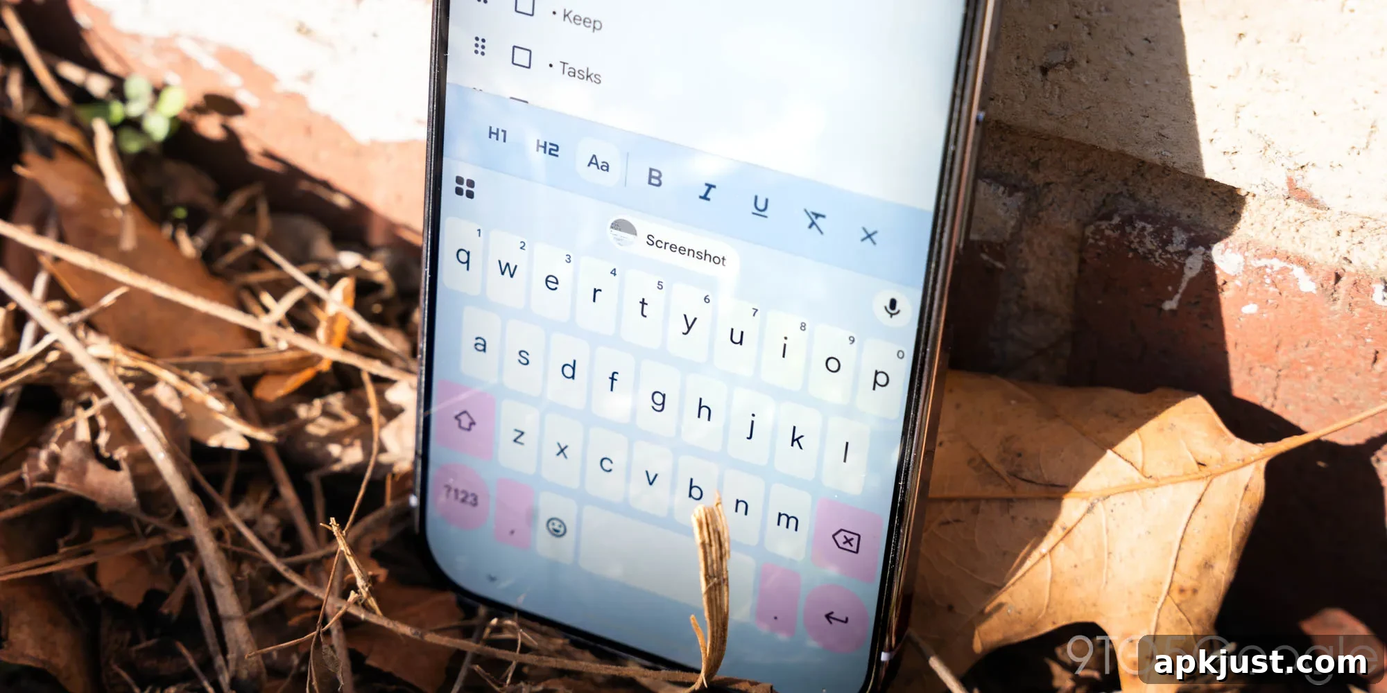
Gboard introduced a Material 3 Expressive redesign for its shortcuts page in January, and that redesign is now appearing more broadly for beta users.
Update 6/3: With the latest Gboard beta (version 17.5), the redesigned shortcuts interface has returned and now shows a banner reading “Customize your menu and shortcuts.” That message suggests a wider rollout may be imminent, although the update is not yet visible in the stable release.

Update 5/26: Beta users on version 17.4 briefly lost access to this shortcuts redesign. It has not yet reached stable-channel users. The brief disappearance may indicate Google is preparing a broader rollout.
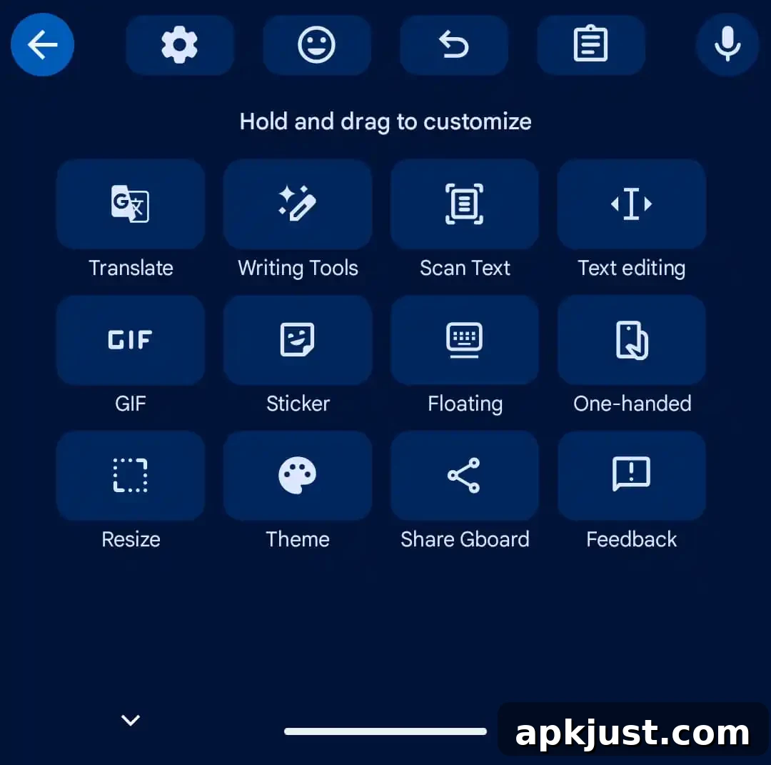
Original 5/18: Historically, Gboard displayed shortcuts in a compact grid. Each shortcut lived in a small rectangular card, and when you resized the keyboard you could often see the entire shortcuts grid without vertical scrolling.
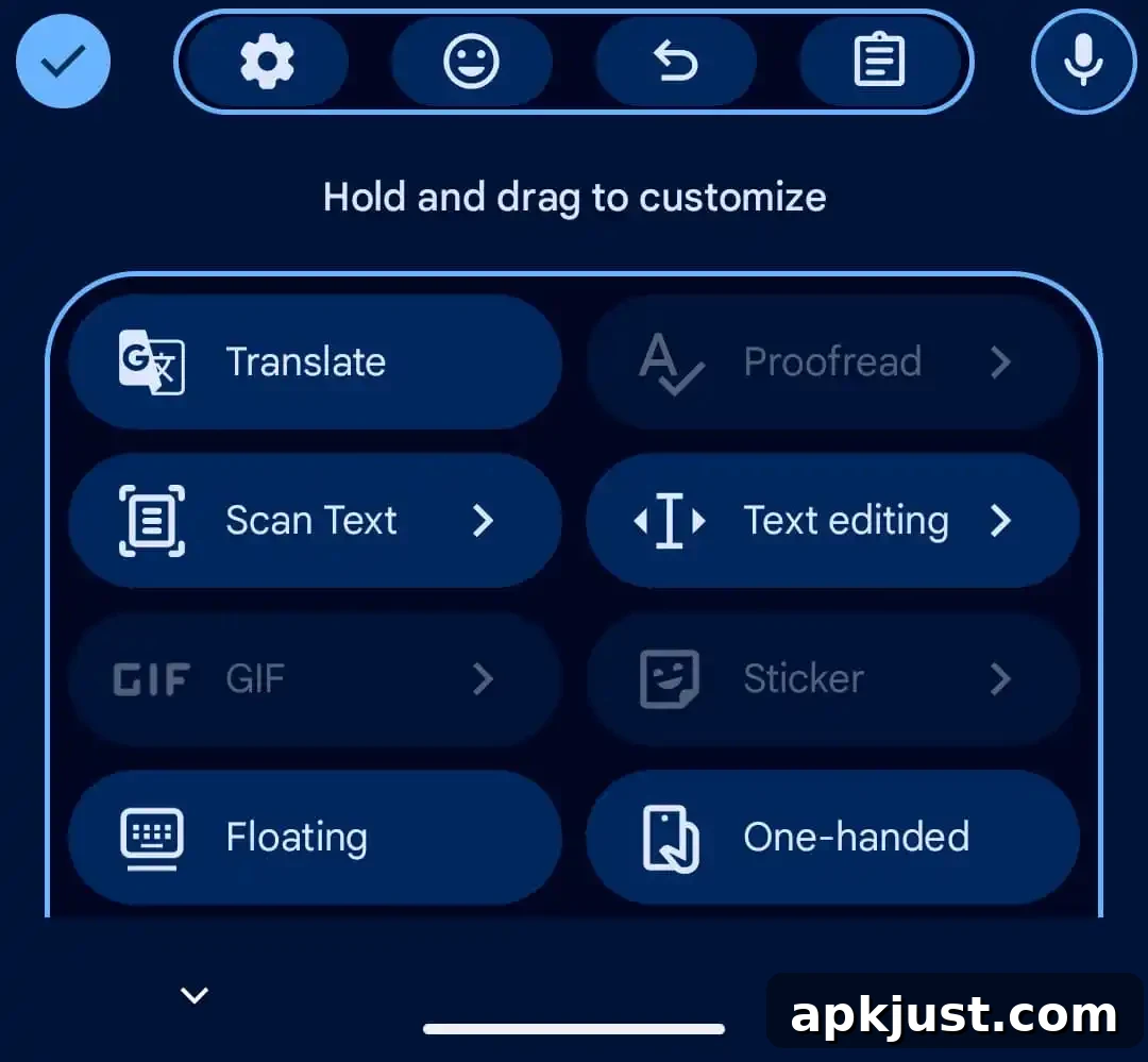
The new Material 3 Expressive layout replaces the rectangular cards with rounded “pill” containers. Two shortcuts now fit per row, and you swipe horizontally to move between pages of tools. The design aims for a cleaner, more modern look that aligns with the broader M3 Expressive visual language.
Old vs. new
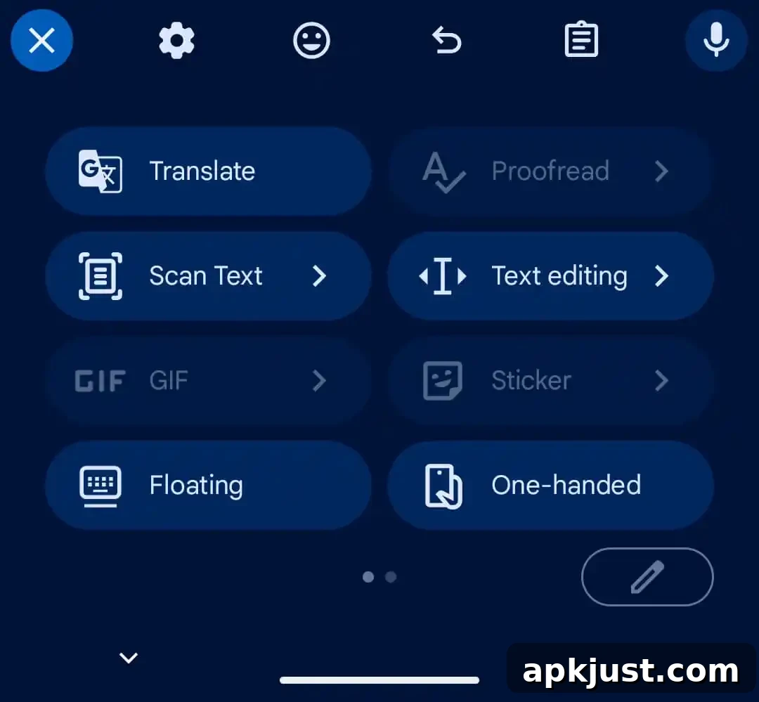
The shortcut icons themselves remain the same, but the text labels are displayed larger and positioned to the right of each icon. In some cases, longer labels do not fully fit the pill container and will scroll, which can be a minor annoyance depending on the name length.
You can tap the pencil icon to edit shortcuts. The customization screen also adopts M3 Expressive elements, showing rounded containers and an instruction that reads “Hold and drag to customize.” This provides more visual consistency across the shortcuts experience.
Separately, shortcuts that appear in Gboard’s suggestion strip were updated as well: these suggestion items drop their rounded containers and the back arrow used previously has been replaced by a close “×” icon in the top-left corner. The change simplifies the strip while keeping actions accessible.
This shortcuts redesign follows the recent Material 3 Expressive refresh applied to the Gboard Settings page. Over the past week the updated look has rolled out to many beta testers running Gboard version 17.3, while stable-channel users have not yet received the changes.
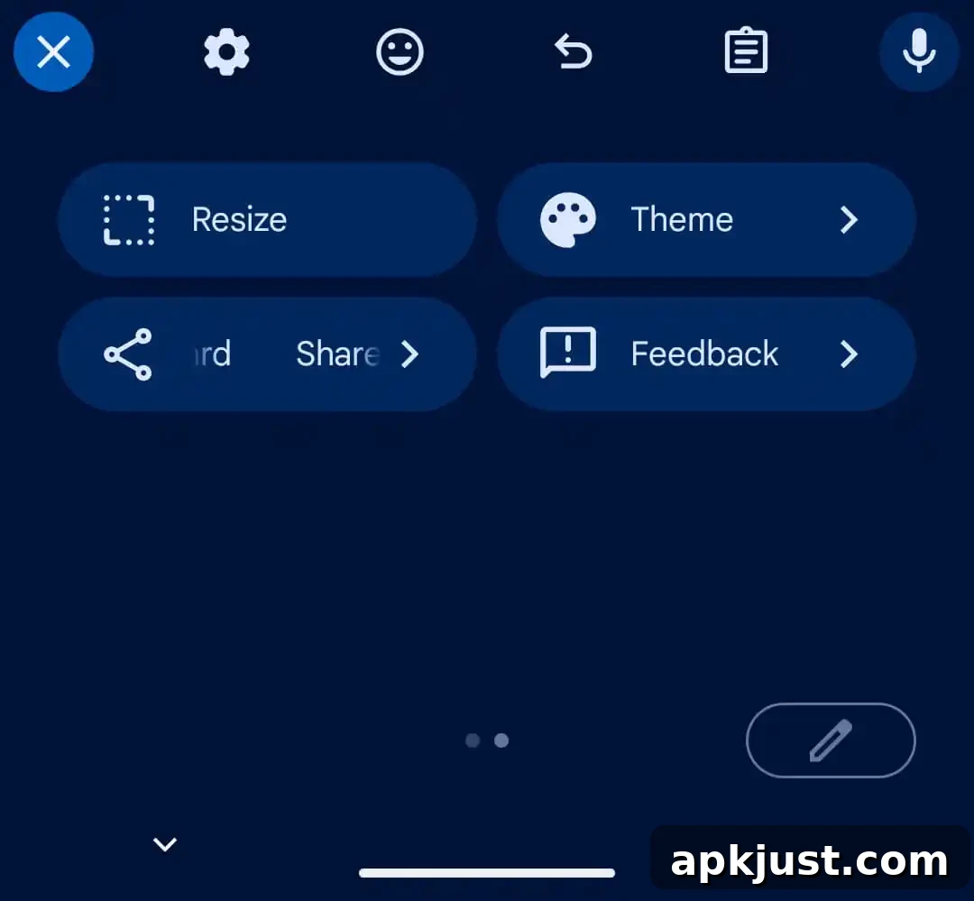
In summary, the Material 3 Expressive update to Gboard’s shortcuts moves the interface away from compact rectangular cards to larger, rounded pills with bigger labels and horizontal paging. The change aligns with Google’s wider M3 Expressive design language and introduces minor behavior differences — such as label scrolling and an updated suggestion-strip close control — that users should notice when the update reaches stable releases.