
One UI 8.5 has begun rolling out widely after a lengthy beta period, and many Galaxy owners who recently updated have noticed a change in how dark mode renders across apps. The update brings subtle visual shifts that affect background tones and accent colors, which some users interpret as inconsistency in the system dark theme.
Dark mode is now a standard option on nearly every modern smartphone, but manufacturers and app developers take different approaches to implementing it. Google’s dark themes often use deep gray tones rather than absolute black to preserve contrast and readability. Apple typically favors pure black on OLED displays for maximum contrast and battery savings. Samsung’s approach historically landed somewhere between those two philosophies: some Samsung apps use pure black, while other system elements and third-party apps default to dark gray.
After the One UI 8.5 update, a number of users have shared screenshots and notes showing that some apps—especially certain Google apps—are displaying noticeably lighter gray backgrounds when dark mode is enabled. The change is prominent enough that users have described the result as “inconsistent” across different apps and screens.
Those reports are not universal. Some Galaxy devices that updated to One UI 8.5 show the older, darker tones as before, while others now present a lighter default gray on elements previously rendered in near-black. Community posts and screenshot comparisons highlight these visual differences, but the experience depends on specific device settings and which color accent system is active.
The core of the change appears to be related to Samsung’s handling of Material You color accents, referred to in One UI as the “color palette.” One UI 8.5 seems to introduce a new default palette tone that affects how app backgrounds and surfaces are shaded when users have not selected a custom palette. For devices that keep the default palette, this can result in a slightly lighter overall background in some apps.
Some advanced users have reported that reverting the default palette to the previous setting or choosing a darker static accent can restore a more uniform appearance across apps. Others note that enabling Material You theming across the entire UI brings the expected darker tones back into both Samsung and Google apps. Conversely, turning off Material You theming or relying on the new default palette can leave certain apps with the lighter gray backgrounds that have prompted complaints.
It’s worth emphasizing that this is primarily a design and theming issue rather than a functional bug. The variation results from how One UI interprets and applies color palettes and surface tones to different app components. Samsung’s theme engine maps Material You or static palette colors to UI surfaces, and small changes to those mappings can change perceived brightness and contrast. That mapping can vary between system apps, Samsung’s own apps, and third-party apps that follow Android’s theming guidelines differently.
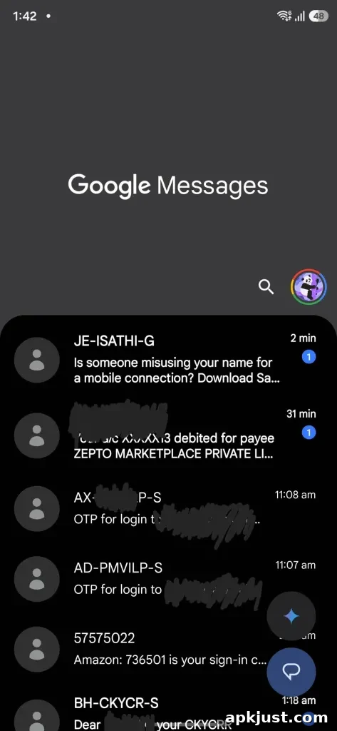
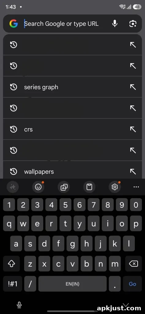
For users who prefer a consistent, darker experience across all apps, there are a few practical steps to consider: enable Material You theming for the entire system so accents and surfaces align with the chosen palette, manually pick a darker static accent color offered by One UI, or check for any app-specific theme settings that might override the system default. These adjustments can help restore more consistent contrast and reduce the unexpected light gray surfaces some users are seeing.
Samsung’s theming system is flexible and increasingly powerful, but that flexibility means default choices can have wide visual impact. As One UI continues to evolve, expect more refinements to how palettes and surface tones are applied. In the meantime, if you find the new default look undesirable, experimenting with palette and theme settings should make it possible to achieve a darker, more uniform dark mode across both Samsung and third-party apps.
More on Samsung:
- One UI 8.5 brings visual and under-the-hood changes that affect theming, privacy, and performance.
- Color palette and Material You integration can alter app backgrounds and accents depending on system settings.
- If you notice inconsistent dark mode behavior, adjust the system palette or app-level themes to restore preferred contrast.
Follow Ben: Twitter/X, Threads, Bluesky, and Instagram