
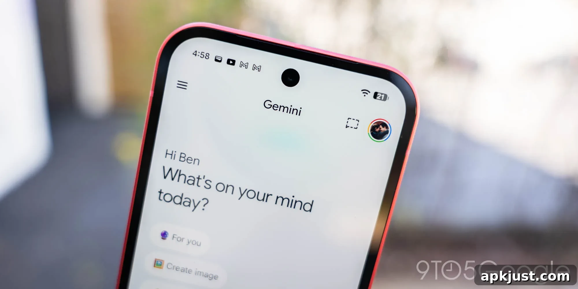
As Google prepares for I/O 2026, the company has quietly refined the Gemini app icon, giving it a slightly more colorful and vibrant appearance.
The familiar spark shape — officially the Gemini spark — remains unchanged in form, but the graphic has been modestly enlarged. Since the redesign introduced last July, blue has been the dominant hue in the icon. This latest update reduces the blue coverage slightly in the top, left, and bottom quadrants to introduce more red, yellow, and green tones.
Old vs. new
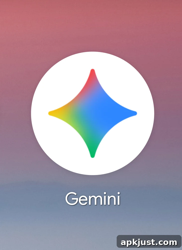
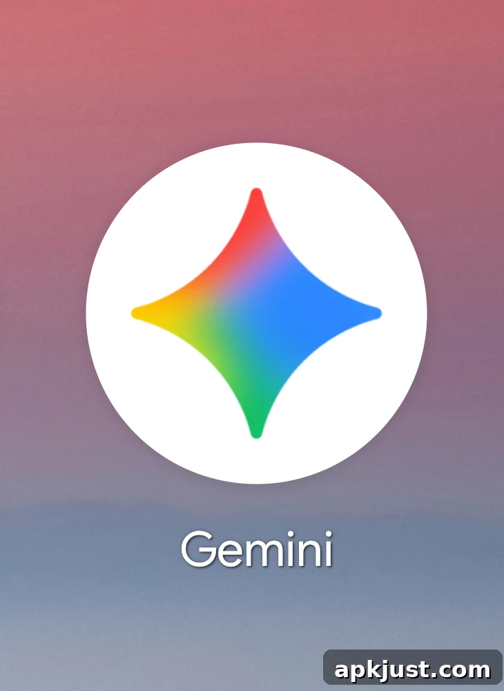
Beyond the change in color balance, the updated icon uses more vivid, solid colors with reduced gradient effects. The result is a flatter, punchier look that reads clearly on modern displays. These adjustments are subtle by design: at small sizes, such as a homescreen icon or a web favicon, many users may not notice the difference immediately.
This icon adjustment is being distributed with the Gemini app release on Android that adds the homescreen shortcut. The rollout is tied to version 1.0.913571982 of the Android Gemini app, though the update is not yet available to all users. Separately, the refreshed icon has already appeared in the Gemini apps for iOS and macOS, so users on those platforms may see the change sooner.
More on Gemini:
- “Gemini Spark” is Google’s upcoming AI agent in the Gemini app — an initiative that highlights Google’s ongoing work on assistant-style experiences and integrated generative AI.
- Gemini’s overlay on Android functions similarly to Circle on Search, extending quick access and contextual AI features across the operating system.
- The Gemini app is also undergoing a full redesign that refreshes and reorganizes much of the user interface to better showcase new capabilities and improve usability.
Icon updates like this are a common part of a major app’s visual evolution. Small refinements to color, scale, and contrast help maintain a fresh, modern brand presence while ensuring the icon remains legible across device types and screen resolutions. For designers and product teams, these tweaks balance brand recognition with the need to adapt to shifting visual trends and platform guidelines.
If you use the Gemini app on your phone or desktop, watch for the version noted above or check your device’s app update history to see when the icon change reaches you. Because the adjustment is minor and intentionally subtle, it’s most noticeable when the previous and new icons are compared side by side, as in the images above.
Overall, the updated Gemini icon preserves the spark motif while refreshing the palette to feel brighter and more contemporary as Google heads into I/O 2026 and continues to evolve the Gemini product family.