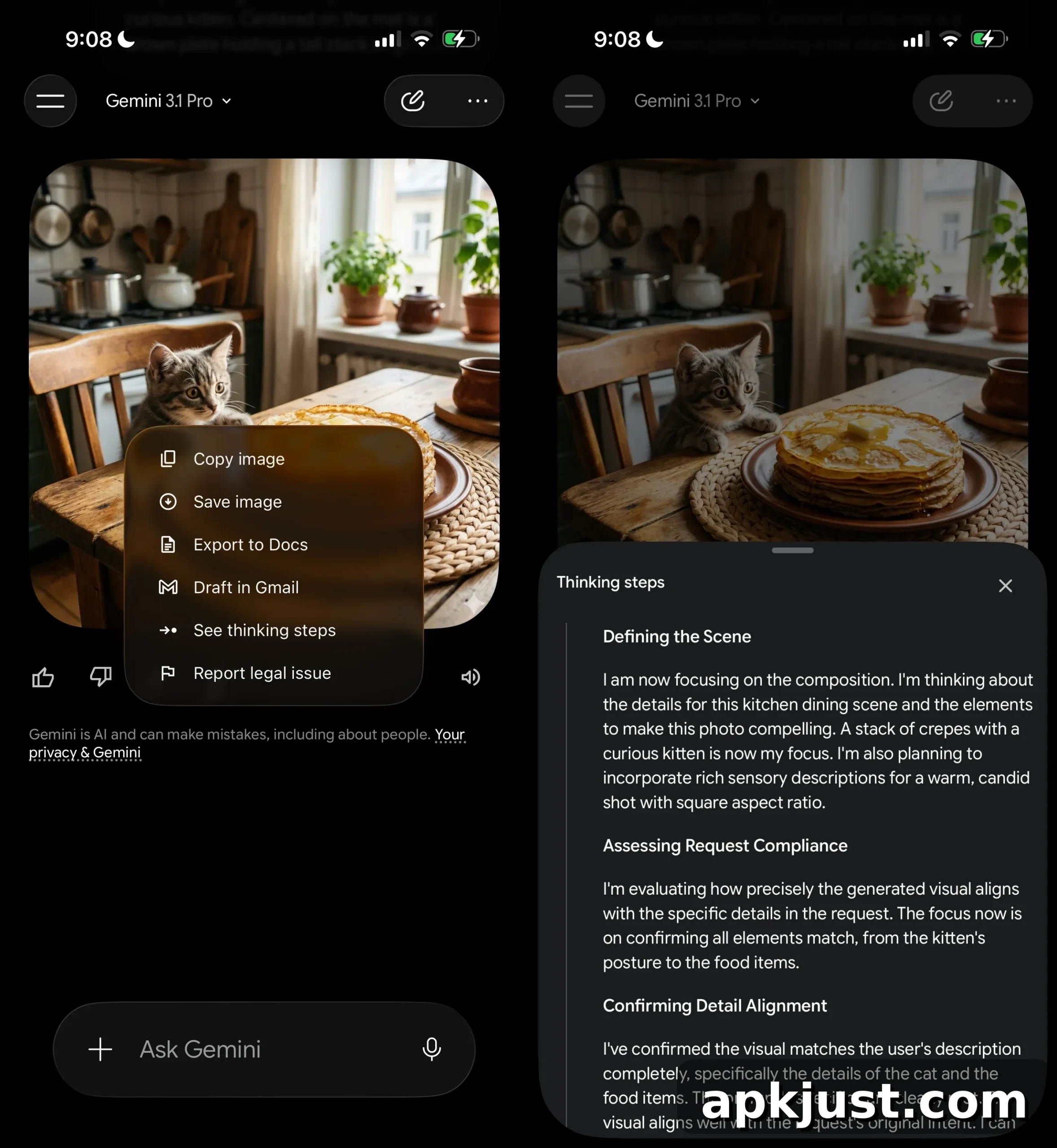
Google has been quietly testing a major redesign of the Gemini app for several months, and we’re now getting our first clear look at the full overhaul. The updated interface refines the app’s home screen, navigation, and visual presentation, with a focus on unified tools and a sleeker, modern aesthetic.
On the redesigned homepage, the main input area is now a pill-shaped prompt box that anchors the experience. Voice input and a shortcut to Gemini Live appear to the right of the prompt, while a single plus button provides quick access to additional actions. Tapping the plus opens a bottom sheet with a horizontal carousel that lets users quickly open Photos, launch the Camera, and browse recent images. The bottom area of the sheet offers quick links for Files, Notebooks, and More uploads, consolidating common upload and content actions into one place.
Below the prompt, a curated list of tools is presented with concise descriptions for each item. The list includes Images, Videos, Music, Canvas, Deep research, and Guided learning, reflecting Google’s effort to present diverse creative and research-oriented capabilities in one unified panel. This approach has been trialed across platforms, and similar layouts have appeared in desktop and Mac versions of the Gemini client.
New iOS design?! by u/TaxOld2989 in GeminiAI
A personalized greeting now appears prominently: “Hi [name], what’s on your mind?” This welcome message is centered on the screen with the Gemini spark icon positioned just above it. The background behind the prompt and greeting uses a colorful, pulsating gradient that animates subtly, creating a lively and modern visual backdrop that enhances the app’s overall personality.
The redesign also revisits UI placement choices. The model picker has been moved back to the top-left corner and now functions as a dropdown menu, restoring a familiar pattern for switching models. Iconography throughout the app has been updated to favor thin, rounded outlines, giving the interface a lighter, more refined appearance.
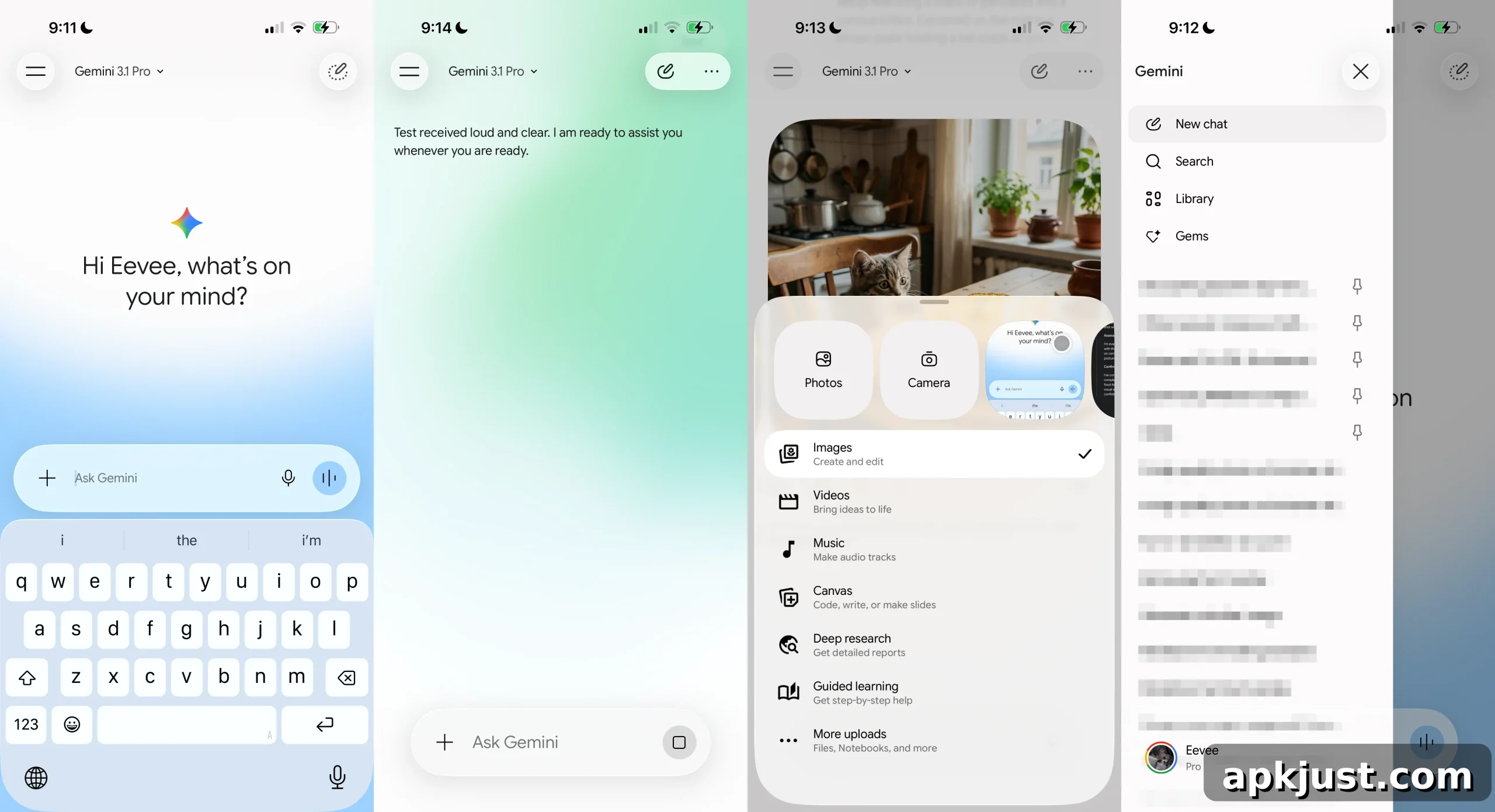
Navigation has been simplified in several ways. A temporary chat button appears as the primary action on the main screen, while the account switcher has been moved to the bottom of the navigation drawer—a notable shift from the placement commonly used in many first-party apps. This relocation places account controls out of the main visual path and reduces clutter near the top of the interface.
When composing prompts or interacting with chat responses, the app makes full use of the animated gradient background, creating a visually rich experience that emphasizes user focus. The effect is particularly pronounced when the input field is active, providing a sense of depth and motion without overwhelming the content.
Within chat threads, Google has moved the option labeled “See thinking steps” into the overflow menu. Selecting that option opens the model’s intermediate reasoning as a bottom sheet, keeping the conversation view uncluttered while still offering transparent access to the model’s thought process when desired.
On iOS, the redesign leans heavily on a Liquid Glass-style visual treatment, which emphasizes translucency, blur, and layered surfaces. Earlier updates introduced initial support for widgets and notebooks that used similar visual language, and the current design extends those principles across the app’s core screens. The Android implementation remains less clear; Google has tested parts of this unified interface on Android, but the full visual treatment and interactions may differ between platforms.
Reports of users seeing this redesign on iOS have appeared in recent days, though the rollout appears to be limited and staged. That suggests Google is continuing to iterate on both the visual design and interaction patterns based on feedback and internal testing before a wider release.